
Wednesday, 31 March 2010
Ideaology
I used the concept of cutting out 5 people and placing them in a separte background to give my cover a 'yearbook' feel, where the image is superimposed. This intentional convention and the vintage colour of the image gives (as though it has been found) the cover a very indie and old school vibe. I used the conventions of "THE YEAR OF..." to suggest that the image was found in an old yearbook. I used conventions from the magazine to the left by using a similar 'Centuary' font, writing in upper case letters and placing the slogan in the center. 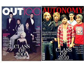
Subscribe to:
Post Comments (Atom)
No comments:
Post a Comment