Wednesday, 7 April 2010

Wednesday, 31 March 2010
Ideaology
I used the concept of cutting out 5 people and placing them in a separte background to give my cover a 'yearbook' feel, where the image is superimposed. This intentional convention and the vintage colour of the image gives (as though it has been found) the cover a very indie and old school vibe. I used the conventions of "THE YEAR OF..." to suggest that the image was found in an old yearbook. I used conventions from the magazine to the left by using a similar 'Centuary' font, writing in upper case letters and placing the slogan in the center. 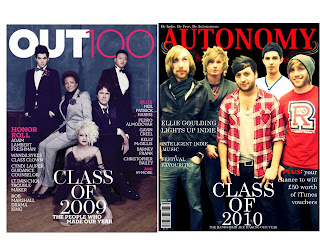

Saturday, 27 March 2010
Earlier research on Interview Conventions

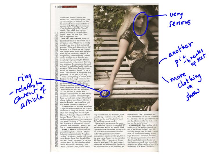
Medium long shot - of the immediately recognisable interviewee - makes focus of the article clear. Close enough we can see her expression but enough space to see everything she is wearing.
Pull quote - italics used to indicate her voice.
Pose stretches across page to draw article together.
Her Gaze directed at viewer with slight smile & pout – a deliberately provocative expression which links to the standfirst questioning her ‘nice girl’ image.
Mise en scene
Clothing & make-up plays on the word ‘bitch’: deliberately ‘hard’, sexy and vamp-ish – a suspender belt is revealed without the stocking.
Setting/location: plays on the word ‘nice’ – pretty flowers and natural setting perhaps linking to her name which sounds like ‘fern’ the plant
Overall: the contrast creates juxtaposition between the two sides of Fearne Cotton. The journalist is deliberately trying to ‘scoop’ a new angle on the well known presenter. We can expect that as the introduction to the interview informs the reader about her new fashion line, agreeing to this interview was on condition that the shoot promoted a ‘fashion’ angle. These are sure to be clothes from her new line. This shot has more in common with high fashion shots than a conventional interview portrait.
Image hue/saturation
The image appears to have been treated so that it has the feel of sepia image and is reminiscent of early photographs that were painted and tinted with colour. This choice, bearing in mind the modern clothing and pose creates a further interesting contrast perhaps underlining the naughtiness beneath the nice exterior.


Friday, 26 March 2010


Wednesday, 24 March 2010


Tuesday, 23 March 2010
Final Magazine
The following are my final pieces of my Indie music magazine called AUTONOMY. I may do a few more tweaks, but nothing too major so this is practically the beginning of the end of my coursework. :D My front cover has a large masthead, barcode, price, graphics, a slogan, a central image, an issue number and text of articles and features that can be found inside. Overall all of these are regular conventions of current music magazines.  I decided to not insert the text of the 'CONTENTS' as three separate sections and instead followed traditional conventions of having the contents across the banner at the top of the page. I also added an image of Jordan from 'RizzleKicks' at the top right hand corner which makes the page have a more 3D feel and makes Jordan seem like he is popping out from the page.
I added an issue number and the date of the months the magazine is issued for (feb - March), this also convey that my magazine is a monthly magazine. I changed the layout of the page and put the column to the right hand side because people naturally read from left to right. I also have information that tells readers to visit the magazine website. I followed further conventions by giving freebies such as a poster which is usually a regular feature in music magazines such as 'NME'. As you can see I incorporated the flash effect onto the image in my interview (top right hand corner). I have a standfirst which follows current conventions in other music magazines. I have two pull quotes in the middle of the interview with text wrapped around it. I used graphics around the text. I embedded quotes instead of having the usual boring question and answer format, I chose to be unconventional because AUTONOMY has a more vintage, unique and sophisticate feel and the older TA will be able to follow the interview format without needing it to be too simplistic.

I decided to not insert the text of the 'CONTENTS' as three separate sections and instead followed traditional conventions of having the contents across the banner at the top of the page. I also added an image of Jordan from 'RizzleKicks' at the top right hand corner which makes the page have a more 3D feel and makes Jordan seem like he is popping out from the page.I added an issue number and the date of the months the magazine is issued for (feb - March), this also convey that my magazine is a monthly magazine. I changed the layout of the page and put the column to the right hand side because people naturally read from left to right. I also have information that tells readers to visit the magazine website. I followed further conventions by giving freebies such as a poster which is usually a regular feature in music magazines such as 'NME'.
 As you can see I incorporated the flash effect onto the image in my interview (top right hand corner). I have a standfirst which follows current conventions in other music magazines. I have two pull quotes in the middle of the interview with text wrapped around it. I used graphics around the text. I embedded quotes instead of having the usual boring question and answer format, I chose to be unconventional because AUTONOMY has a more vintage, unique and sophisticate feel and the older TA will be able to follow the interview format without needing it to be too simplistic.
Friday, 19 March 2010
Constructing my contents page: Photography

 I really like the flash of this image above and want to incorporate it into the latter picture. I will position a flash into my final picture for my interview page which will create a party feel and hopefully be better than the previous artficial lights I had.
Please click on the images to enlarge
Subscribe to:
Posts (Atom)