
Wednesday, 31 March 2010
Ideaology
I used the concept of cutting out 5 people and placing them in a separte background to give my cover a 'yearbook' feel, where the image is superimposed. This intentional convention and the vintage colour of the image gives (as though it has been found) the cover a very indie and old school vibe. I used the conventions of "THE YEAR OF..." to suggest that the image was found in an old yearbook. I used conventions from the magazine to the left by using a similar 'Centuary' font, writing in upper case letters and placing the slogan in the center. 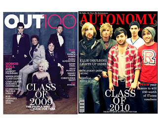
Saturday, 27 March 2010
Earlier research on Interview Conventions

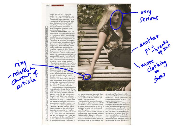
Medium long shot - of the immediately recognisable interviewee - makes focus of the article clear. Close enough we can see her expression but enough space to see everything she is wearing.
Pull quote - italics used to indicate her voice.
Pose stretches across page to draw article together.
Her Gaze directed at viewer with slight smile & pout – a deliberately provocative expression which links to the standfirst questioning her ‘nice girl’ image.
Mise en scene
Clothing & make-up plays on the word ‘bitch’: deliberately ‘hard’, sexy and vamp-ish – a suspender belt is revealed without the stocking.
Setting/location: plays on the word ‘nice’ – pretty flowers and natural setting perhaps linking to her name which sounds like ‘fern’ the plant
Overall: the contrast creates juxtaposition between the two sides of Fearne Cotton. The journalist is deliberately trying to ‘scoop’ a new angle on the well known presenter. We can expect that as the introduction to the interview informs the reader about her new fashion line, agreeing to this interview was on condition that the shoot promoted a ‘fashion’ angle. These are sure to be clothes from her new line. This shot has more in common with high fashion shots than a conventional interview portrait.
Image hue/saturation
The image appears to have been treated so that it has the feel of sepia image and is reminiscent of early photographs that were painted and tinted with colour. This choice, bearing in mind the modern clothing and pose creates a further interesting contrast perhaps underlining the naughtiness beneath the nice exterior.


Friday, 26 March 2010


Wednesday, 24 March 2010


Tuesday, 23 March 2010
Final Magazine
The following are my final pieces of my Indie music magazine called AUTONOMY. I may do a few more tweaks, but nothing too major so this is practically the beginning of the end of my coursework. :D My front cover has a large masthead, barcode, price, graphics, a slogan, a central image, an issue number and text of articles and features that can be found inside. Overall all of these are regular conventions of current music magazines.  I decided to not insert the text of the 'CONTENTS' as three separate sections and instead followed traditional conventions of having the contents across the banner at the top of the page. I also added an image of Jordan from 'RizzleKicks' at the top right hand corner which makes the page have a more 3D feel and makes Jordan seem like he is popping out from the page.
I added an issue number and the date of the months the magazine is issued for (feb - March), this also convey that my magazine is a monthly magazine. I changed the layout of the page and put the column to the right hand side because people naturally read from left to right. I also have information that tells readers to visit the magazine website. I followed further conventions by giving freebies such as a poster which is usually a regular feature in music magazines such as 'NME'. As you can see I incorporated the flash effect onto the image in my interview (top right hand corner). I have a standfirst which follows current conventions in other music magazines. I have two pull quotes in the middle of the interview with text wrapped around it. I used graphics around the text. I embedded quotes instead of having the usual boring question and answer format, I chose to be unconventional because AUTONOMY has a more vintage, unique and sophisticate feel and the older TA will be able to follow the interview format without needing it to be too simplistic.

I decided to not insert the text of the 'CONTENTS' as three separate sections and instead followed traditional conventions of having the contents across the banner at the top of the page. I also added an image of Jordan from 'RizzleKicks' at the top right hand corner which makes the page have a more 3D feel and makes Jordan seem like he is popping out from the page.I added an issue number and the date of the months the magazine is issued for (feb - March), this also convey that my magazine is a monthly magazine. I changed the layout of the page and put the column to the right hand side because people naturally read from left to right. I also have information that tells readers to visit the magazine website. I followed further conventions by giving freebies such as a poster which is usually a regular feature in music magazines such as 'NME'.
 As you can see I incorporated the flash effect onto the image in my interview (top right hand corner). I have a standfirst which follows current conventions in other music magazines. I have two pull quotes in the middle of the interview with text wrapped around it. I used graphics around the text. I embedded quotes instead of having the usual boring question and answer format, I chose to be unconventional because AUTONOMY has a more vintage, unique and sophisticate feel and the older TA will be able to follow the interview format without needing it to be too simplistic.
Friday, 19 March 2010
Constructing my contents page: Photography

 I really like the flash of this image above and want to incorporate it into the latter picture. I will position a flash into my final picture for my interview page which will create a party feel and hopefully be better than the previous artficial lights I had.
Please click on the images to enlarge
Thursday, 18 March 2010
Preliminary magazine
This is one of the first pieces of work I did at A-level for a magazine that I made with a target audience who were College students that wanted to go to University. This was my front cover, contents page and interview page. As you can see it was done on publisher and is not as professional looking as my current music magazine where I used Photoshop. I think my design skills have improved alot throghout the process of making an indie music magazine, especially as I have researched current conventions of music magazines and tried to incorporate them.

Wednesday, 17 March 2010
Research of Indie music. Video of gig and recording type of music.
The video above is a rehearsal session with the band that will be on my front cover ('The Special K's).
I really enjoyed my time interviewing and photographing them for my magazine, although I used their image I decided to add different band/artists throughout the rest of my magazine and interview. The video is a snippet of the 'Special K's' Indie sound and overall vibe. The quality is slightly poor because it is during sound check at a gig and the guys are still practicing their set.
Please press play to view the video
Tuesday, 16 March 2010
Understanding my Target Audience
The current name for my music magazine is 'Autonomy'. It's a working title and sounds a bit long. Here is another brainstorm of ideas and names for my magazine.  Overall I think I have decided that AUTONOMY works best out of all other suggestions and names that have come from brainstorming.
 Overall I think I have decided that AUTONOMY works best out of all other suggestions and names that have come from brainstorming.
- ICONOGRAPHY:
Ellie Goulding: a very current and new British female Indie artist who is releasing a new album called "Lights". I am intending to mention her on my front cover and have an article about her that is mentioned in my contents page. I think the female target audience will find her admirable and inspirational. The male target audience will be interested in her because of her sex appeal and musical talent. I am inspired by this artist and my TA is a similar age (13-23). Therefore, I think it's a good way to address my TA by adding Ellie Goulding as a featured Indie artist.


I want to aim at males who are also part of my target audience. Here are Indie boy bands and the type of layout and conventions used in images that are taken of male artists and bands. I intend on using central male figures (At least 5 of them) on my front cover. The males will attract both a male and female audience because male and other younge talent will aspire to be like them and females may find them attractive.

Saturday, 13 March 2010
My Colour Palette
The image bellow is a colour pallete of the theme of colours that I intend to use throughout my magazine. The colours are very unisex colours. They give off a very vintage and unique style, yet the colours are versatile. My TA are young adults of 15 – 23 and I think the colours I have chosen will appeal to them because there is the welcoming conventional colours of black, red and white (usually found in many Indie and Rock music magazines such as NME and Q), while an option of a deeper red (maroon) and dark blue to contrast flatteringly against it.
The colours represent a contemporary tone juxtaposed with a vintage and fashionable vibe that will be visible throughout my entire magazine. 
Friday, 12 March 2010
First Draft of contents

Being critical of my own work:
I really like the theme of using colours such as black, dark red and dark blue in my contents page. I used the convention of separating the word 'contents' into three parts, however, while trying to be unconventional for a dramatic effect I feel this looks odd, so I may change it. Additionally I think the picture has worked out well. The text needs to be justified and made smaller because other images such as the poster need to stand out. Therefore, I intend on switching the images about. Furthermore people read from left to right so the text box will move to the left of the page. So watch this space :)
Contents page conventions
 I really liked the layout of this contents page. Especially the way the text of the actual CONTENTS sign is separated into three sections. Other coventions:
- The Masthead usually always appears in bold, appearing in bold colours such as black and whit against contratsing background colours. There is a clear, sophisticated and noticeable font which makes it stand out from the background. It is situated near to the top of the page so that readers immediately know it is the contents page.
- Features are shown in a column type of format and tells you all articles you will find in teh magazine. The cover story is usualy made bold on the contents page. Many conetnts pages give you the basic story line of an aricle so that you know a little and are intreuged to read more. bit about what is going to be found on that specific page. The more important words are highlighted or are in bolder text, this brings the readers attention to it.
- Image: This tries to bring fashion into the contents page. The image is usualy rekated to another artical inside and is of an artist or band which is related to the genre of the magazine, they are frequently dressed stereotypically towards the type of music; this brings the readers attention more to the features as it sets the tone, mode and overall vibe of the magazine. This shows yet another way of attracting a particilar TA or social group.
- Page numbers are almost always noted beside a cover, it has a breif line that uses a language techniques such as play on words, alliteration and onomatopoeia. These are also to help aid the readers of the whereabouts of the information they are seeking.
- Additional information on the conetnts inlcude an email address, letter from the editor (although this is not always essential) name of the of the institution, subscriptions, freebies, general information about certain artists and relative information about the genre of music. Overall all these conventions are used to be more personal, informative, guiding, edgy, cheeky feel and make the reader get a bit of extra information as a way of entertainment and value for their money.
Saturday, 6 March 2010
Information on my front cover
When I am producing and designing my front cover for my Indie music magazine I need to start with a brainstorm of ideas for a name for my magazne. I have been thinking about this for a while and this is a brainstorm I produced for inspiration.
Now I have my name: Autonomy. I need to think look back on research I did earlier on front cover magazine conventons and constructing my magazine front cover.
This will be a challenge as I need to make it relevant to my target audience who are teenagers and younge adults 15 - 23. The magazine needs to relate to my target audience and this is through conventions such as edgy and outspoken language. A unisex colour scheme and a welcoming overall vibe.
 Click image to view larger version - The text may be unclear due to the image being scanned
Friday, 5 March 2010
Test shots and outakes, different camera angles, mise en scene etc.
Here is a taster of what the guys get up to when they are not too cool for school or posing for my ultra cool indie magazine...


 I really liked the images above because it shows RizzleKicks having fun and conveys thier easy going style. I was dissapointed that I couldn't use some of the images because they were either not in focus or the wrong vibe of my magazine. Because the images are very playful, I really wanted a more sophisticated tone to the magazine. The image above has Jordan who is in focus, so I may cut him out using photoshop (losso tool) and put him onto the interview or contents page. My main image has turned out successul and has been posted earlier.
Wednesday, 3 March 2010
Simultation Task

As part of research for creating a music magazine I was given a task to create a magazine cover for young people who are aged 13 years and above. The genre of music that an individual who read the magazine would read about and listen to was 'Alternative Rock' and 'Rock-rap'. The target audience I had to focus on were also 'skater kids' who have interests in learning new tricks on skate boards, listening to cool music that is part of the 'skater kid' scene, as well as an interest in professional skate boarding. The cover I would be creating for the TA was also going to be made as a purpose to promote our magazine to mock advertisers such as mobile phone companies, record labels and other marketers who would invest in our magazine. The large picture on the front of the magazine above is of a professional skate boarder called Ryan who is a young and popular skater; this will appeal to my target audience as they would be instantly familiar with him. The colours used are bright and bold which attracts the reader and also relates to the theme and genre of this magazine. I chose artists such as 'Muse' and 'My Chemical Romance' to mention on my cover because they appeal to the genre of Rock are popular Rock bands that the TA listen to. I also changed the font scheme on the front cover as I wanted to keep the magazine unusual and not repetitive; however, I still wanted the fonts to compliment each other without looking convoluted. Lastly the advertisements on the cover for skateboards and clothing was particularly chosen as it relates closely to the genre of the magazine (Hard Rock) and the competition for skateboards is attractive to the reader as it is a one-off opportunity and could lead to an increase in sales. Furthermore, our mock advertisers would get a sample of the type of endorsements we already receive. What I particularly like about the cover is the word play of Skate (written Sk8) because it goes beyond the status quo and is more appealing to the young TA. If I have to improve the magazine I would use Photoshop to give the magazine cover a more 3D effect by adding some layering. Overall the task was enjoyable, whilst also informative because I gained an understanding of marketing, drafting, re-drafting and advertising a magazine and this was a good way of understanding the process of starting a magazine.
Pictures of bands performing
 This is also another image I could use. I intend on editing the lighting because the lead singers faces are slightly washed out. I like the fact that the drummer is visible in the background.
 This is an image of the 'Special K's' (the band I intend on using in my front cover) performing. The background is faded and the band members are not visible in the back, however, I like vibrant colour that is being reflected on the lead singer.
 I am hoping to include more pictures of bands and artists performing live into my magazine. The image above is well positioned(mid-shot), however, I am going to edit the picture in order to put more focus on the lead singer.
 This is the image after I have edited the lighting and cropped the picture. I will also add a lens flare and possibly a spotlight. Overall I have used this image to my advantage by making it a poster that is a freebie which will be a feature mentioned on my contents page, it can be obtained upon purchase of my magazaine. In order to do this had to add a drop shadow to make the image look like a poster and more 3D on the contents page.
Tuesday, 2 March 2010
Pictures I have taken for my front cover and rough layout
 I have a few options to choose from for my front cover. The image above is of the band "The Special K's" (after they have removed thier jackets). I had to direct the band to stand in a central position that would also allow me to put a masthead above their heads. I edited the contrast fo the image to give it an almost vintage feel.
 The image above is a test photograph. The background needs to be edited. I am sceptical about this picture because it was taken before a few members of the band removed thier jackets.
Bellow is a very rough layout of my front cover, I will use the latter image above as my background image and layer the text on top. Th image bellow is just to give me an understanding of where I will lay everything out on my front cover.

Subscribe to:
Comments (Atom)